McKnight Brain Institute
Website Redesign
Completed: Summer 2020
SERVICES
Market & User Research
User Journey Analysis
Content Audit
Site Architecture Redesign
Wireframing
Graphic and Web Redesign (WordPress)
Maintenance
COLLABORATORS
Todd Taylor, Project Manager
Michelle Koidin Jaffee, Science Writer
Project Overview
Goals
Redesign website into a beautiful, functional and easy to access site that communicates institute values.
Showcase the value of becoming a McKnight Brain Institute (MBI)-affiliated faculty member or student.
Increase accessibility to comply with Web 3.0 Standards and federal website regulations for public institutions.
Constraints
Working within a templated Wordpress website and heavily branded university system
Phases
Phase 1:
Research & Ideation
Phase 2:
IA & Wireframes
Phase 3:
Visual Design & Maintenance
Phase 1:
Research & Ideation
Analyzed Google website analytics
Top web page visits were to our Research Areas, general information and an internal form used to gain access to the MBI building after hours.
Using these insights, I changed the Research Areas and Forms pages from children to parent pages.
I also reorganized the Contact page to better display where users can look to for the correct department to contact. Since this is a big institute, users often looked at our webpage first to see whom they should contact


Generating User Personas
Based on user interviews and discussions with stakeholders, I constructed the following personas for faculty, students and staff:


Phase 2:
IA & Wireframes
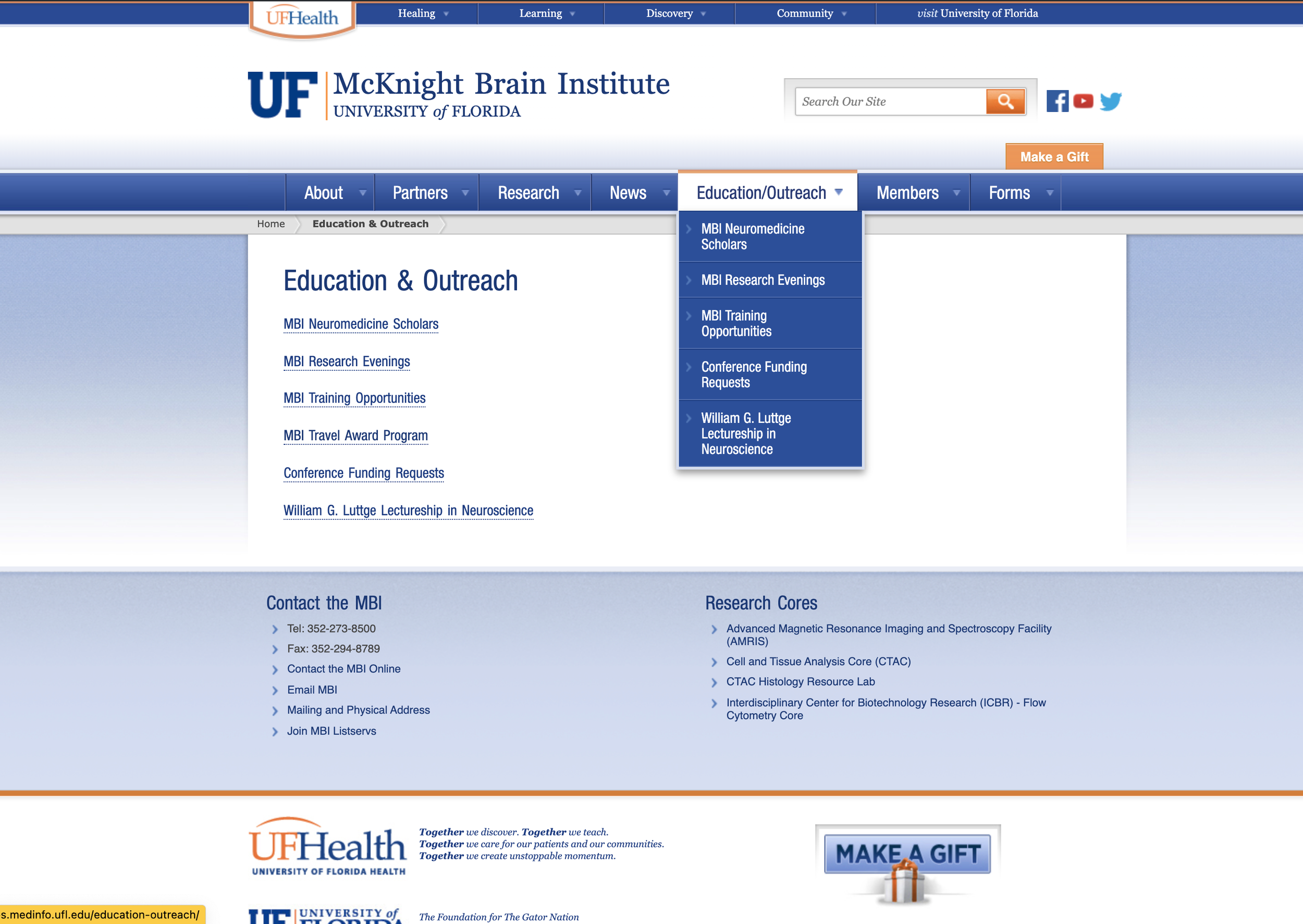
When working on the information architecture of the website, I wanted to allow our distinct audiences to immediately find the information they’re looking for. Since the majority of web traffic was directed to the Education & Outreach and the Research parent pages, I wanted to focus my efforts on making these more intuitive and easily navigable.
The images below show the "before" status of the Research and the Education & Outreach landing pages.
Before

Finalized Sitemap
As you’ll notice, some of the big changes I made had to deal with using child and grandchild pages as a way to separate information based on audiences. Specifically in the Education & Outreach pages, I wanted to give each audience their own sort of landing page with appropriate links for each, in addition to highlighting information that would be beneficial for all audiences.

Additionally, I wanted to showcase grandchild pages on the drop-down navigation bar and on the side-bar navigation. This decision was particularly important under the research focus areas, where data showed our audience was navigating to chronic neurological diseases grandchild page.

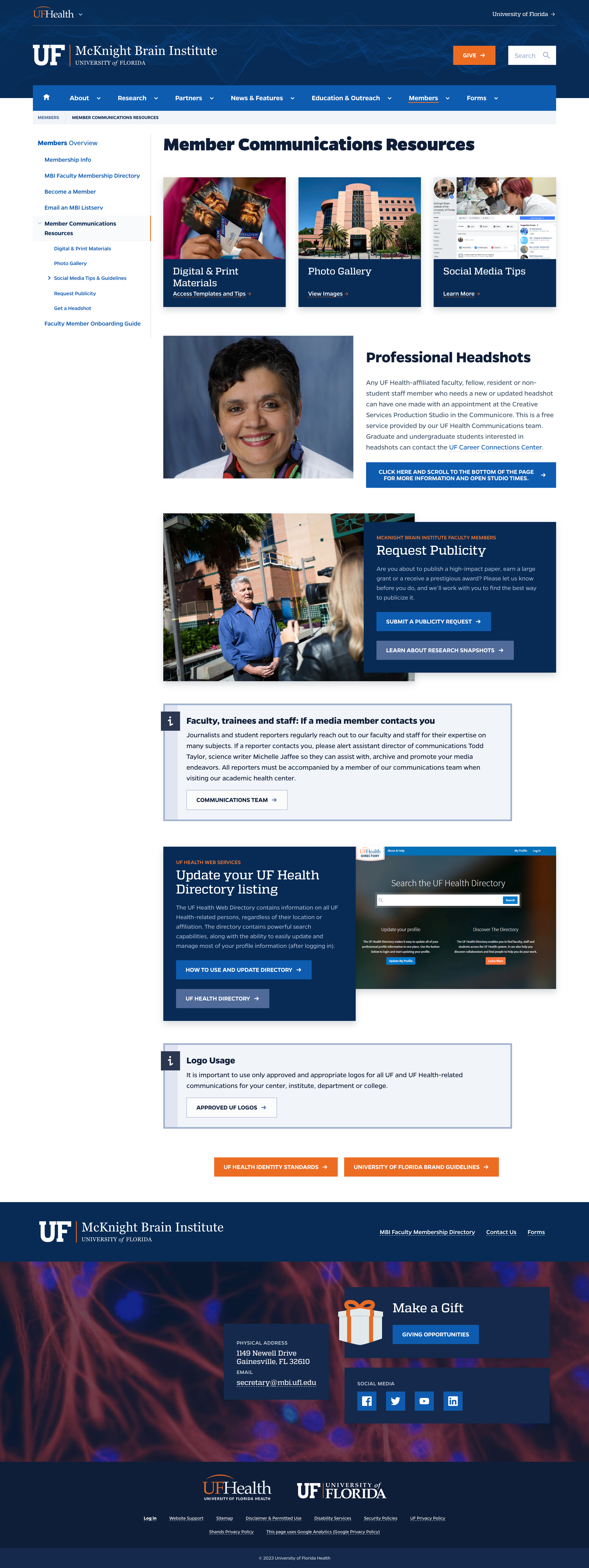
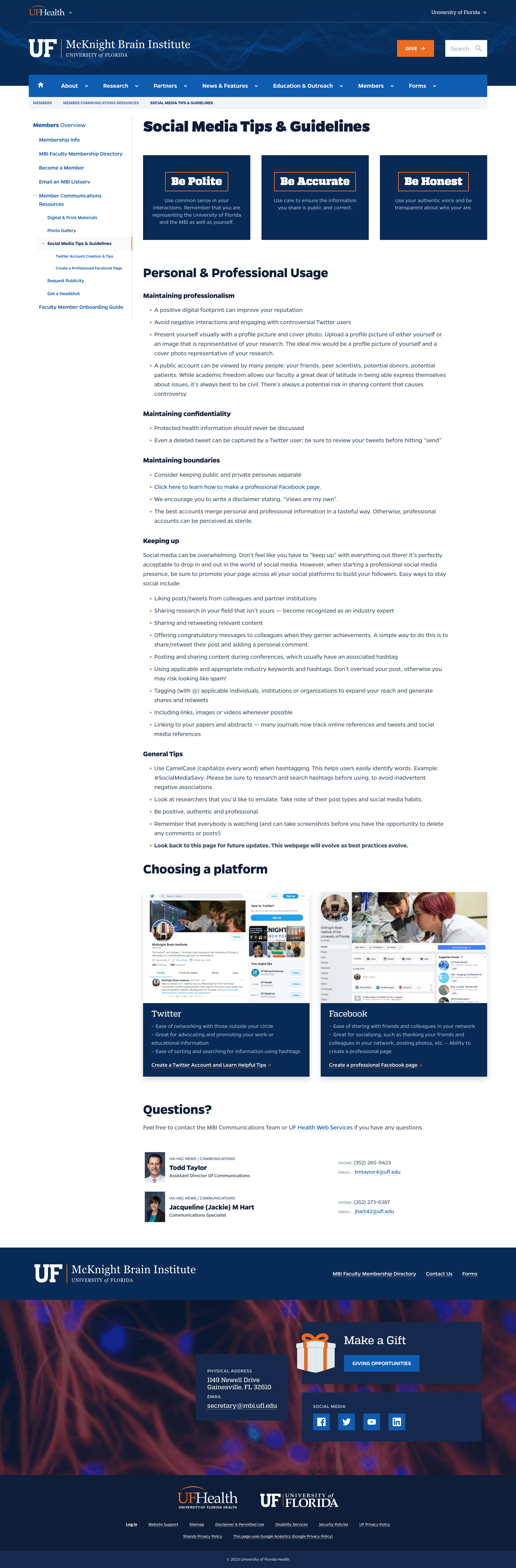
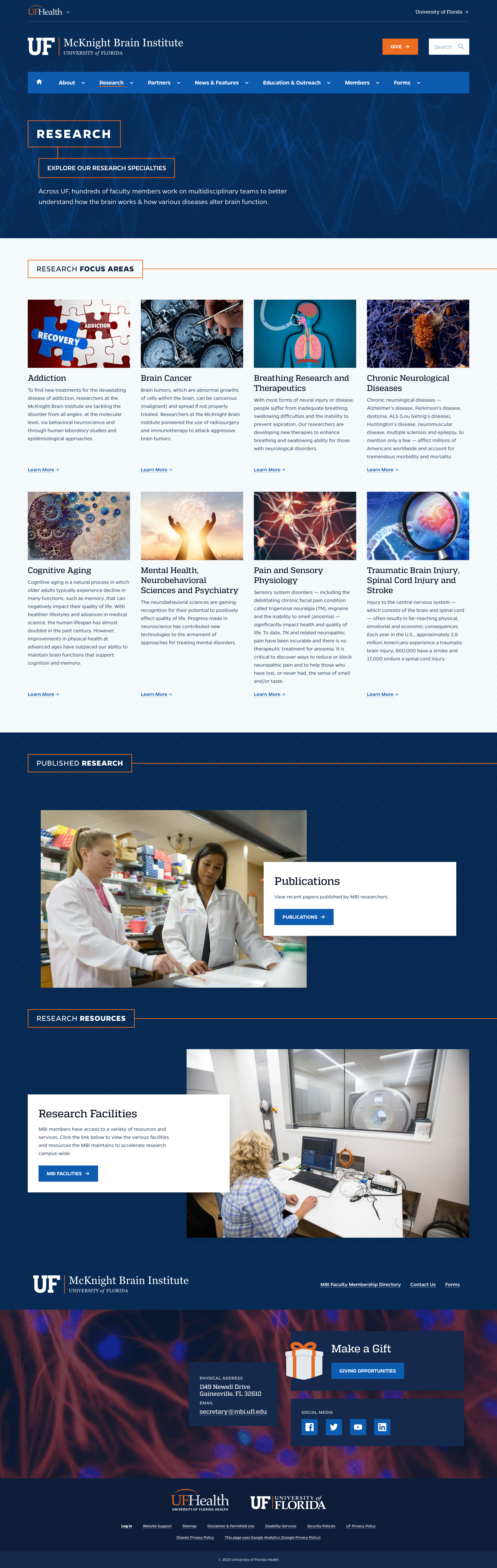
Finished Design